Custom Web Development, Design & Coding For New and Existing Web Sites
Frisky Dog Design Web Development Services Include:
-
Proprietary Custom Web Development, Artwork and Design
-
Expert Coding in HTML 5 and CSS3
[CSS, CSS3, PHP, HTML, HTML5, TLP, FLA, JS, TMP, XML, CRON, RSS, AJAX, Shortcodes] -
Complete Development and Customization of WordPress, CSS & PHP Coding
-
Manage, Redesign & Improve Existing Web Sites
-
Design Services including Custom Artwork, Logos, Branding and Layout
-
Search Engine Optimization & Strategic Marketing

Determining Your Websites Architecture see video
Responsive Website Design
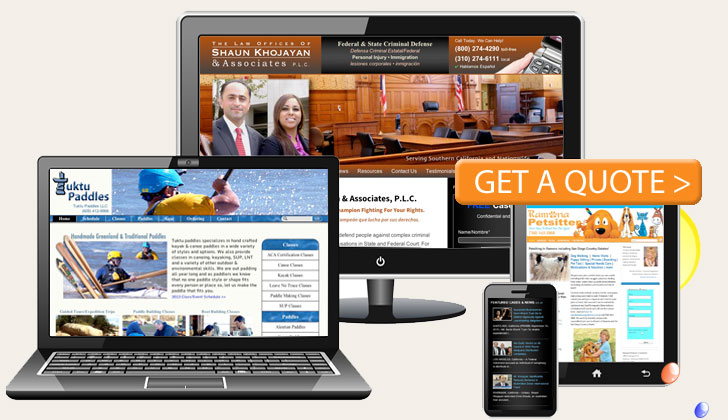
Websites that will automatically scale and adjust itself based on what screen size and screen resolution is detected on the users device. Pictures, text and other content will size and “stack” on top of one another in order to fit screen. They are pretty much one size fits all and are far from optimal on each device and may load slower than a mobile-optimized websites. top
Adaptive Website Designs
Adaptive websites are created for each user’s device, screen size and operating system and give, by far, the best user experience of your sites functionality and design on all devices. The type of the users device (desktop, laptop, smartphone, iPad, Android etc.) is detected and the user is automatically directed to the proper files for that device.
Hybrid Approach
Frisky Dog Design often uses a hybrid approach to website development and design, combining the advantages of a responsive web site with the control of having adaptive parts independently designed and developed for desktop and mobile devices, for example, a separate desktop and mobile home page, separate navigation menu and separate linked pages.
Fixed Width Websites
Fixed width websites are the least expensive and and do not usually use media queries. The fixed size, say, 1000 pixels, will size as a whole proportionally to the screen size being viewed. Sites of this design may be well suited for small business and personal sites where more complex mobile usability is not required.
Fluid Websites (Liquid)
A fluid website is developed using percentages rather the set widths. Each element on page will be sized according to the users screen resolution.
Stand Alone Mobile Applications
Stand Alone apps are often confused with mobile websites such as responsive, adaptive and hybrid web sites designed for mobile devices. A mobile application is faster, more interactive and can integrate with many of your device or computers built in features. However, the application must be installed to be of any use at all. top
Fixed, Fluid, Adaptive, and Responsive Video
Other Resources:
• Responsive Web Design – Google
• Responsive vs. Adaptive


